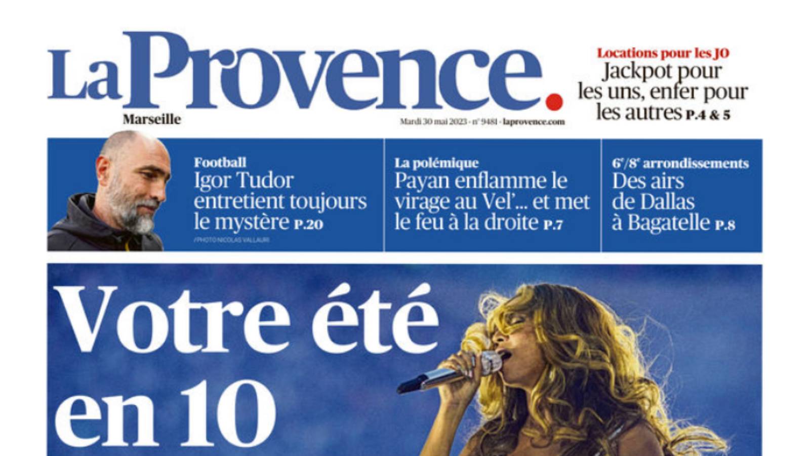
Upgrade Media’s design team came up with the new layout and logo for La Provence. How did they go about making this major change to the identity of this fine PQR title?
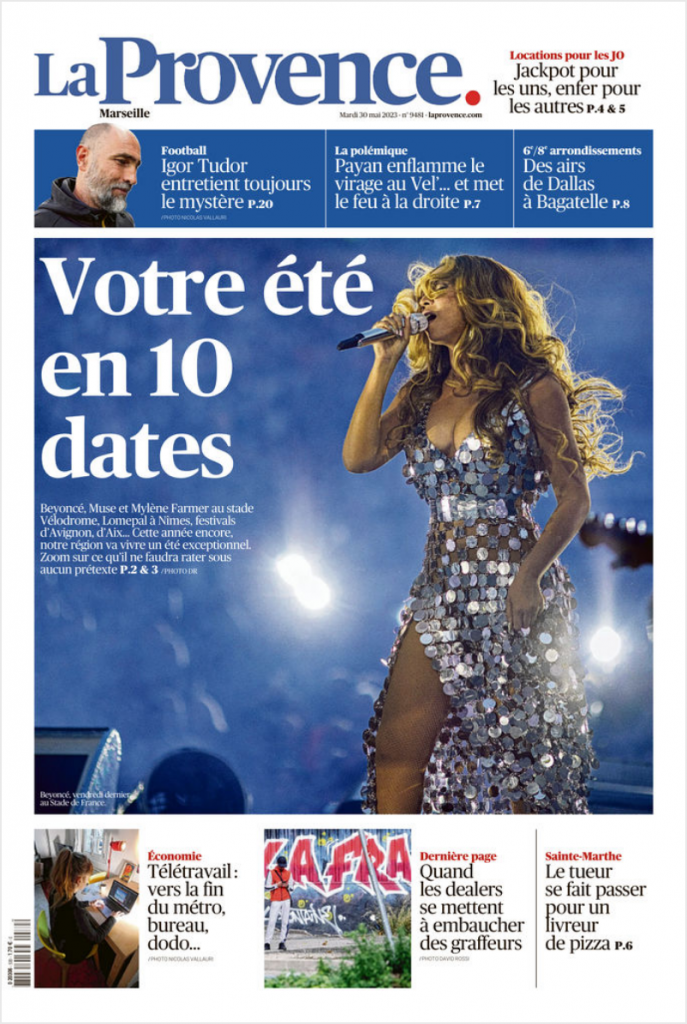
The layout of La Provence had not changed since 2008. That’s why Aurélien Viers, Editorial Director, called in the Upgrade Media team. The aim? To support the newspaper through these profound upheavals and help it reinvent its identity in line with its ambitions to become, in its own words, “a regional multi-channel media of reference”. “We created a new layout, but also a new logo,” explains David Sallinen, founder of Upgrade Media. “When a newspaper changes its layout, it wants to send a strong signal to its readers. To show them that the brand is alive and kicking, that it is keeping up with the times and renewing itself.
A fundamental initial audit: what are the challenges of this new identity?
But how do you go about tackling a project of this scale? First of all, by carrying out an exhaustive inventory. “It was important to take a critical look at what already existed, to define what wasn’t working or what wasn’t working any more, in order to come up with the most appropriate solutions,” explains Upgrade Media. “In the event, La Provence was a newspaper with little rhythm and was very dense. All the spaces were full and the page, like the newspaper as a whole, lacked hierarchy. The signage was too poor.
The next step was to carry out an in-depth audit. The Upgrade Media team spoke to all parts of the newspaper, from editorial to marketing, to understand the challenges of this new identity, “but also the way in which the information works, how it is expressed and digested”. And finally, of course, it was the readership that had to be studied in depth, because “working on the new format of a title means taking it and pushing it towards something different, while keeping its DNA”.

A “four-handed” collaboration between the editors of La Provence and Upgrade Media
And the result? “We worked on a much stronger hierarchy of information, while at the same time lightening the pages to highlight them with white space. The idea was to make it easier to read and easier to see. We have also rethought the segmentation of the newspaper. This involves reinventing the mastheads, making them more present, with fewer flat areas”. And a new font: “As the initial tone was a little too neutral, we tried to give it more elegance, to give the publication a bit of nobility. That’s why we opted for a typeface with impastos.” More style, in short, while remaining within the standards that a PQR newspaper demands.
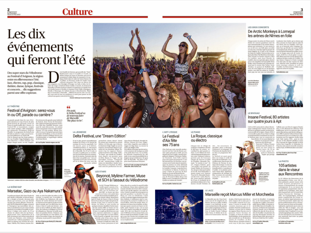
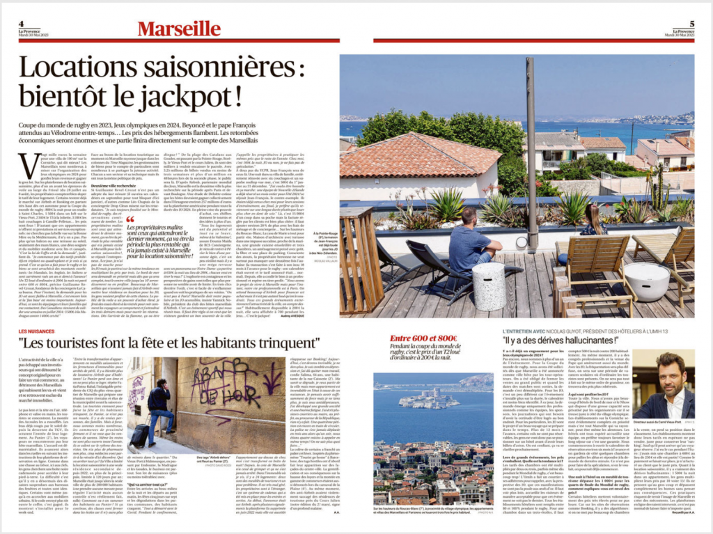
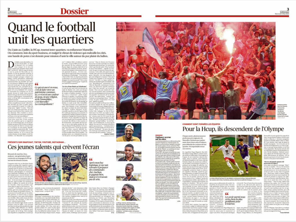
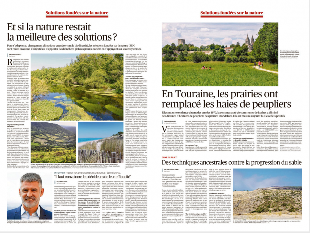
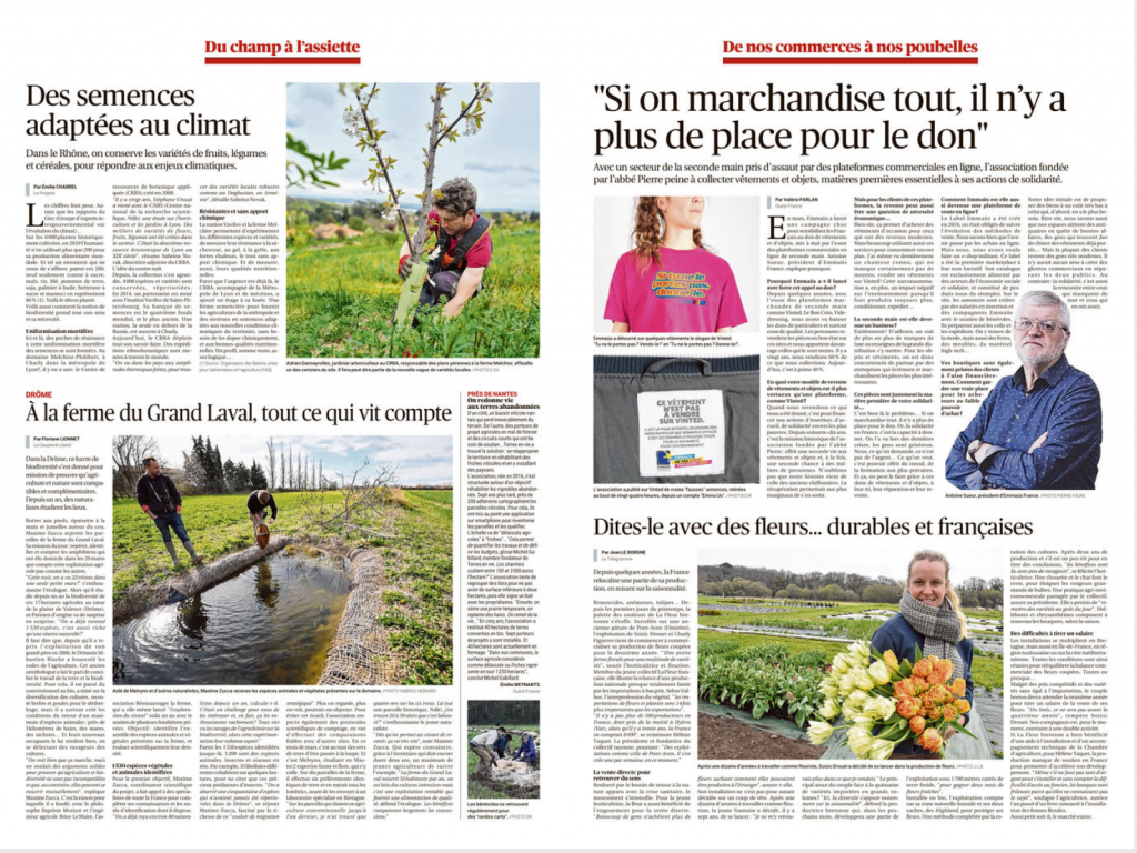
Our motto is: “Content drives form”. “It’s a four-handed job,” concludes David Sallinen. “The editorial team, which has to be clear about its editorial project, and our editorial designers. If the editorial content is well defined, it’s possible, with a new layout, to create innovative formats that move towards more contemporary codes.” From now on, it’s clear: La Provence is entering a new era!
Interview by Rémi Capber, Upgrade Media journalist.
Read more:

La Provence: everything you need to know about the new logo
La Provence: everything you need to know about the new logo On Tuesday 30 May, La Provence presented its readers with a reinvented logo. A creation by Upgrade Media that has won the support of…
◾️ We work for media and communicating companies to accelerate their digital transformations, evolve their organizations, print and digital products, and also develop team agility.
◾️ Check out our Upgrade Media site and its New World Encounters brand to learn more about our projects and approach.
◾️ We hope this article and our other content inspires you!
Thank you for reading.
Keep up to date with all our news by subscribing to our LinkedIn newsletter.
