
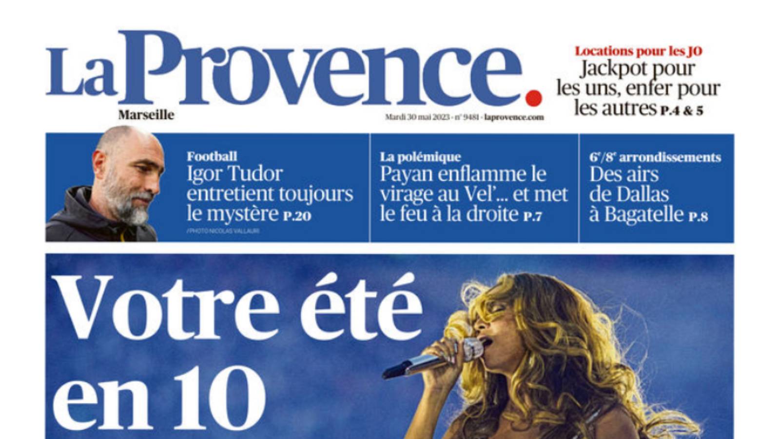
On Tuesday 30 May, La Provence presented its readers with a reinvented logo. A creation by Upgrade Media that has won the support of the newspaper.
A meaningful red dot to replace the bar in the previous logo.
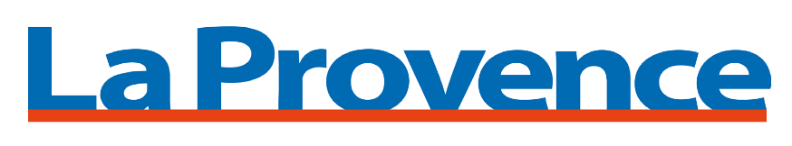
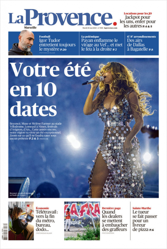
La Provence’s new logo is “unifying and unifying”.”
Naturally, the new logo has been used on all media. “However, it is identical for print and web: it no longer makes sense to differentiate between the two,” says David Sallinen, director of Upgrade Media. “La Provence is a news producer that uses all the channels at its disposal to address its readers. But for special issues, supplements, the Premium space, certain sections, not to mention communications activities, numerous variations have been created, playing on the graphic codes of the first identity. “While keeping the parent brand intact, this has made it possible to assert certain principles: while blue is the editorial colour, it should not be used for events. How was this logo received? Everyone immediately understood the meaning and the logic that led from the old logo to its modernisation. It’s unifying and unifying.”
Interview by Rémi Capber, Upgrade Media journalist.
Read more :
La Provence: the story of a successful transformation with Upgrade Media
Upgrade Media’s design team came up with the new layout and logo for La Provence. How did they go about making this major change to the identity of this fine … Read more
◾️ We work for media and communicating companies to accelerate their digital transformations, evolve their organizations, print and digital products, and also develop team agility.
◾️ Check out our Upgrade Media site and its New World Encounters brand to learn more about our projects and approach.
◾️ We hope this article and our other content inspires you!
Thank you for reading.
Keep up to date with all our news by subscribing to our LinkedIn newsletter.